Apr 082011

I just finished laying out the game postcards for Six Gun, a quick little clapping game where you play gunfighters trying to shoot each other quickly. I talked a bit about the design of the physical cards themselves a bit over on unDesign, but I’d like to note a couple of things about the game design here, as well.

As I mentioned over there, it’s based on a childrens’ game called High Noon. The play is really almost identical, except for one or two bits that I changed. First, I added a limit of six bullets to the game; in the original, you can just go on loading and shooting forever. This seems okay at first, but in practice, it leads to any number of degenerate strategies that will make the game just go on and on – the “always hide” thing, the following by one thing, and so on. Which is totally fine for a playground game! Fun!

But my inclinations being what they are, I need to impose some kind of closure on the play, so I added the “six shots to win” rule. That way, if someone is stalling, the other player can rattle off half a dozen bangs and blow the lollygagger away. (You can still sandbag your opponent a little, or both jump right on doing load-bangs, but the “if you both shoot your last bullet simultaneously, you both lose” rule is my band-aid for that.)

The other major change was the addition of a verbal component to the game. This, it turns out, makes it so much harder, for me, anyway. Maybe I’ve got some kind of mouth-brain-hand dumbness, but it really takes a lot of concentration for me to only count down the bullets when I’m loading the gun, instead of shooting it. It’s pretty fun to break down in the middle of a game like this, though – it kind of reminds me of the simple/impossible 1-2-3 clapping warmup from improv – but it’s a good way to build that mental dexterity, and it definitely adds pressure when the you hear the numbers going up like that. Of course, my screwing it up all the time makes it a little harder to playtest, but it’s all part of the fun, in my opinion.

Fortunately for me, playtesting a game that only requires two people and plays in about fifteen seconds is really easy. This is where my design process falls apart most of the time – I usually either can’t get the bodies together to give something a good go-around, or I personally can’t find a gap in my ridiculous schedule to get new designs to the table. So, this was a refreshing little break from the larger stuff, and I think it worked out really well. Grab a partner and give it a shot, and let me know how it goes!
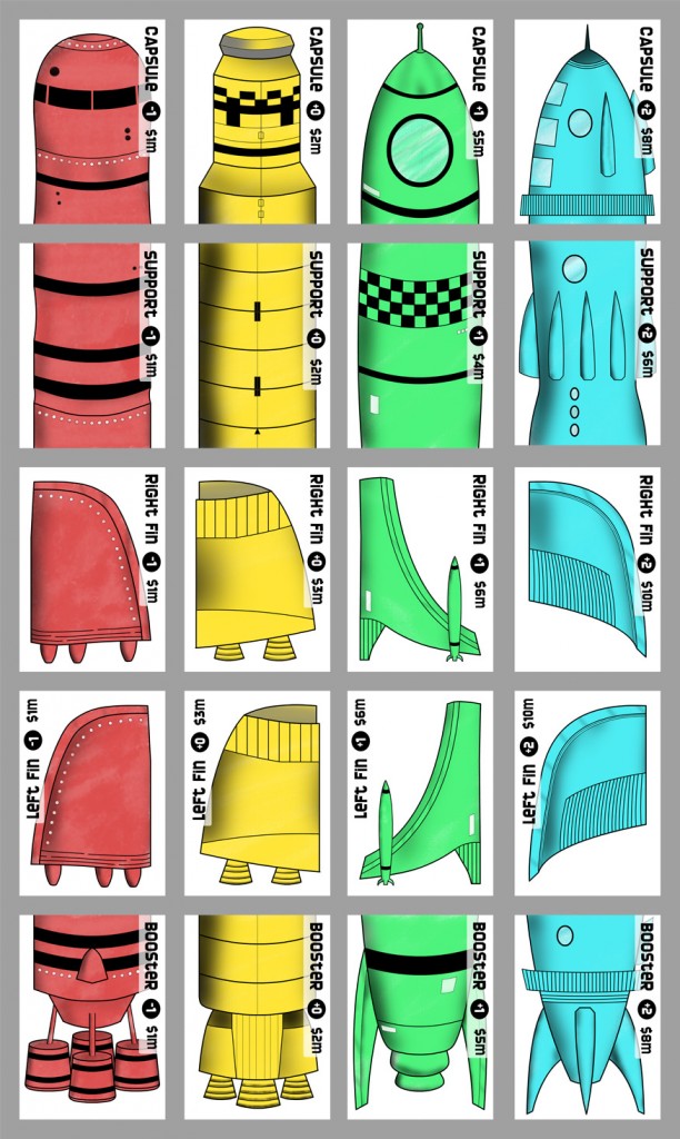
There I was, innocently reading an entry about double-coding and color blindness over on Daniel Solis’s blog, when it struck me that my game RocketYard (self-published in 2009, very close to two years ago today) almost entirely relies upon the players distinguishing cards of different colors, which represent the different qualities of rocket parts that are used to build the ships in the game! This was my first real shot at doing my own graphic design for game cards, so I thought that I’d revisit it and see what’s what. To me, the styles of the rockets of each quality are distinct enough that, even without the coloring, it shouldn’t be hard for anyone to tell them apart (double coding!), but I was curious to see how they fared for actual color blind people.

So, I put out a call on Twitter and Facebook, asking if I knew anyone with color-blindness could take a look at the card images and let me know how they looked to them. I’m not planning on doing a redesign or another printing of the game any time soon, but I figured it’d be good to know for future reference. I do have another card game coming down the pipe directly, so the lessons from this will hopefully apply to the new art, as well.

After getting a good number of responses, I put together this color sheet of the cards, and sent them out to a few friends:

I got some great feedback, almost immediately, which tells me two very important things. First, it looks like I did the right thing, totally accidentally. I suppose that I stumbled upon the correct hues or values such that the weren’t really a problem for anyone, so, go me. Second, it’s also nice to know that I have a bunch of folks who are willing to step up and help out with a request out of nowhere like this, so, go them!

For the record, here are some of the responses, with the names removed for the sake of propriety:

JW: Looks great. Not even close at all.

BS: Well, I can clearly differentiate them, with my partial Color blindness. Don’t ask me what color the last one is though!

GW: They’re fine! Four different colours, to me.

DP: These look fine. The blue and yellow you’ll have very little problem with.  That type of color-blindness is less common.  The red and green are fine for me and I have a pretty significant red/green color-blindness.  The green is a light enough shade and the red is a dark enough shade that I think it’s fine as long as these are color correct for printing.
Also, I think the designs for each ship are different enough that even were a person completely unable to see the colors, they could easily distinguish one ship piece from the other.

So, that’s one design burden removed from my mind. One more thing to check off on the “don’t worry about this any more!” list…