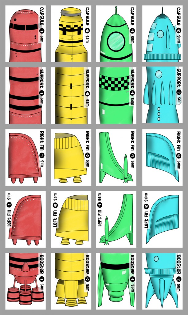
There I was, innocently reading an entry about double-coding and color blindness over on Daniel Solis’s blog, when it struck me that my game RocketYard (self-published in 2009, very close to two years ago today) almost entirely relies upon the players distinguishing cards of different colors, which represent the different qualities of rocket parts that are used to build the ships in the game! This was my first real shot at doing my own graphic design for game cards, so I thought that I’d revisit it and see what’s what. To me, the styles of the rockets of each quality are distinct enough that, even without the coloring, it shouldn’t be hard for anyone to tell them apart (double coding!), but I was curious to see how they fared for actual color blind people.
So, I put out a call on Twitter and Facebook, asking if I knew anyone with color-blindness could take a look at the card images and let me know how they looked to them. I’m not planning on doing a redesign or another printing of the game any time soon, but I figured it’d be good to know for future reference. I do have another card game coming down the pipe directly, so the lessons from this will hopefully apply to the new art, as well.
After getting a good number of responses, I put together this color sheet of the cards, and sent them out to a few friends:
I got some great feedback, almost immediately, which tells me two very important things. First, it looks like I did the right thing, totally accidentally. I suppose that I stumbled upon the correct hues or values such that the weren’t really a problem for anyone, so, go me. Second, it’s also nice to know that I have a bunch of folks who are willing to step up and help out with a request out of nowhere like this, so, go them!
For the record, here are some of the responses, with the names removed for the sake of propriety:
JW: Looks great. Not even close at all.
BS: Well, I can clearly differentiate them, with my partial Color blindness. Don’t ask me what color the last one is though!
GW: They’re fine! Four different colours, to me.
DP: These look fine. The blue and yellow you’ll have very little problem with. That type of color-blindness is less common. The red and green are fine for me and I have a pretty significant red/green color-blindness. The green is a light enough shade and the red is a dark enough shade that I think it’s fine as long as these are color correct for printing.
Also, I think the designs for each ship are different enough that even were a person completely unable to see the colors, they could easily distinguish one ship piece from the other.
So, that’s one design burden removed from my mind. One more thing to check off on the “don’t worry about this any more!” list…
